Tiny UI tweaks I'd love to see in Orion, the Mac web browser
Orion, the Mac web browser, has quickly become my daily driver, thanks to its speed, focus on privacy, and stunning Apple like design. While it's already an impressive browser, a few UI tweaks could make it even better for me.

UI changes I'd love to see
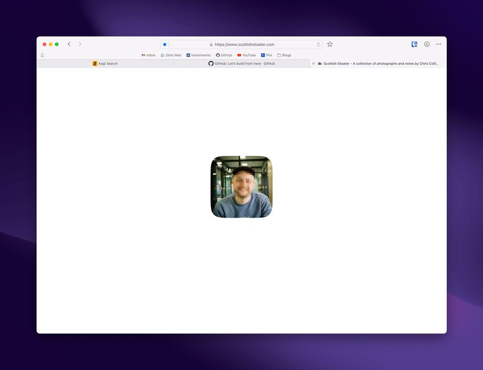
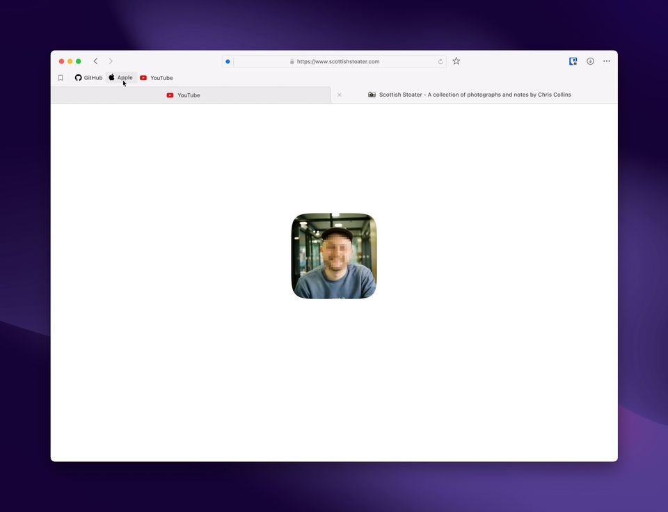
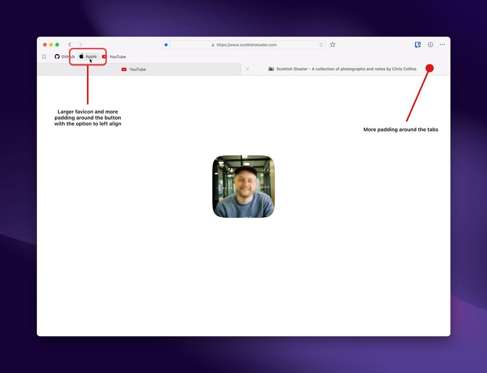
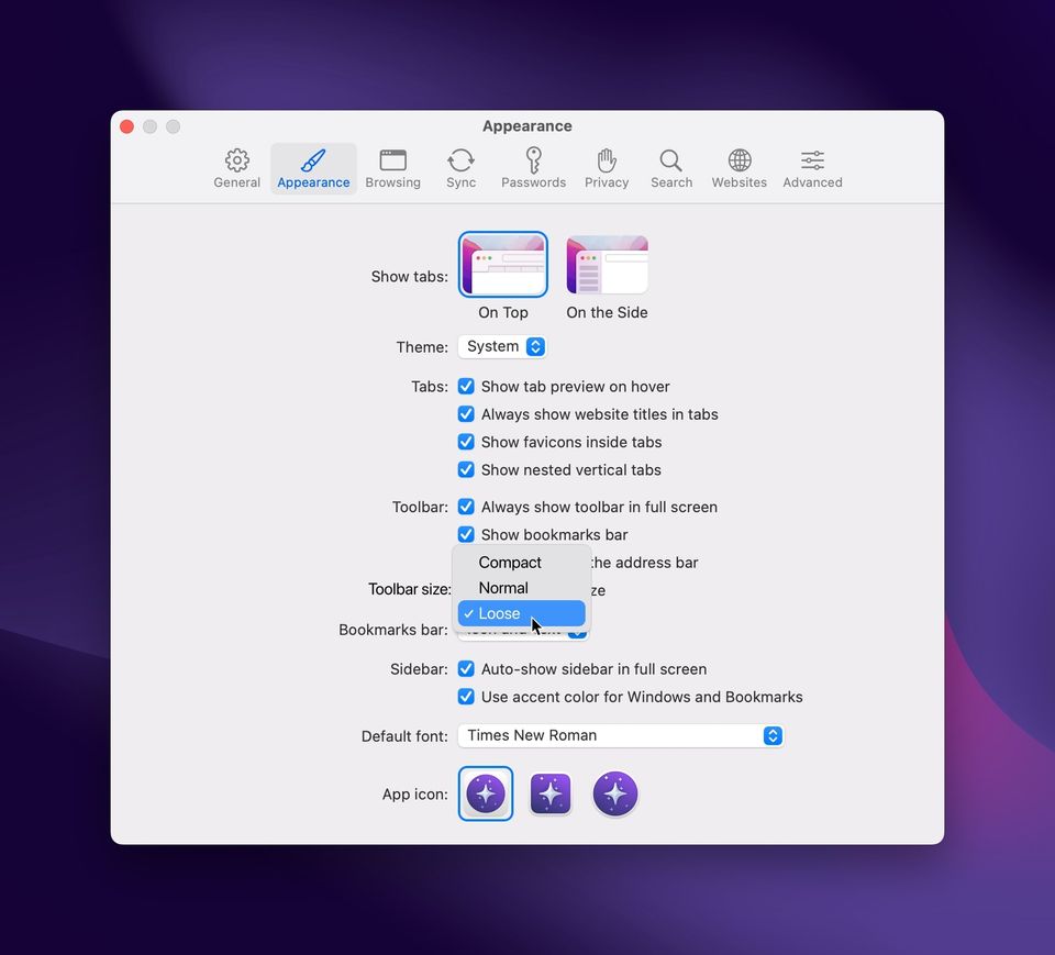
More Padding, Less Condensation: Orion's native Apple like interface is a standout feature, but sometimes, a little extra breathing room can make a big difference. An option to increase padding around elements would enhance both aesthetics and usability. It would provide a more comfortable browsing experience, especially for those of us who appreciate a less crowded look.
Left-Aligned Bookmarks Bar: Customization is key, and having the ability to choose between center-aligned and left-aligned bookmarks bar would be a welcome addition. This tweak allows users to tailor Orion to their personal preferences and align the browser more closely with their workflow.
Custom Icons per Profile: While Orion offers a range of profile choices, the ability to set a complete custom icon (not just chose from 3) for each profile would add a personal touch to the browsing experience. This feature isn't just about aesthetics; it helps users easily identify and switch between profiles, enhancing the overall user experience.


Orion has already won the hearts of many Mac users, but these small UI tweaks could take it to the next level. With these enhancements, it would become an even more personalized and versatile browser, catering to the diverse needs and preferences of its dedicated user base. As Orion continues to evolve, I'm excited to see how it incorporates user feedback to refine its interface and functionality further.